 limma's Multi-Dimensional Scaling plot of sample similarity
30 October 2019
The following plots attempt to summarize the similarity/differences in expression patterns between samples, based on the glog2-transformed normalized read counts. Samples from the same experimental group should cluster together.
limma's Multi-Dimensional Scaling plot of sample similarity
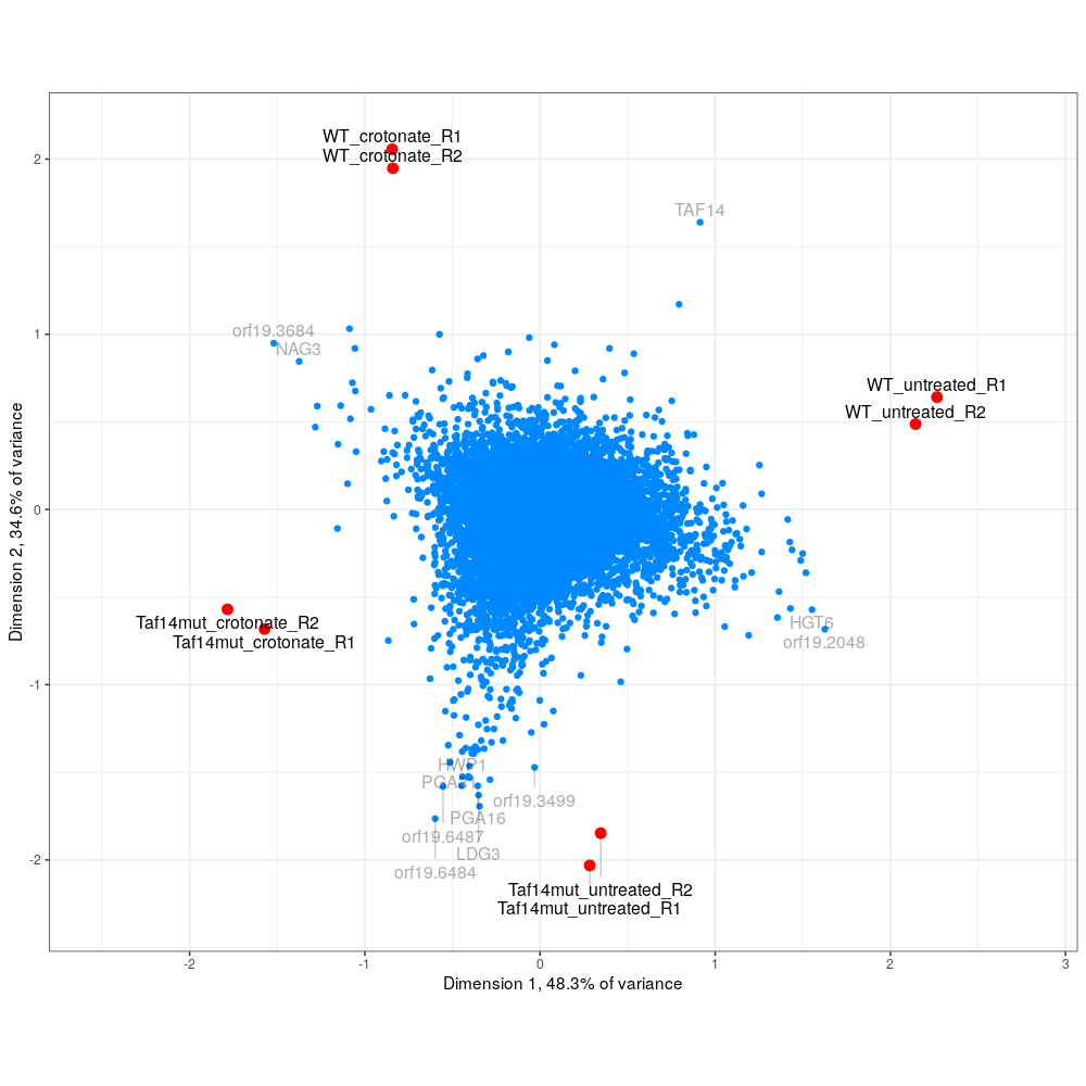 varistran's biplot, similar to plotMDS but shows genes on the same plot
 Split Network visualization of sample similarity.
(Visualization of euclidean distances as a split network. Note: This is not a phylogenetic network.)
This plot shows the distribution of lengths of poly(A) tail sequence in top expressed features. Its main purpose is to assess data quality. If the plot has many bright spots there may be many identical reads, possibly due to non-random digestion.
Only reads with a poly(A) sequence of four or more bases are used.
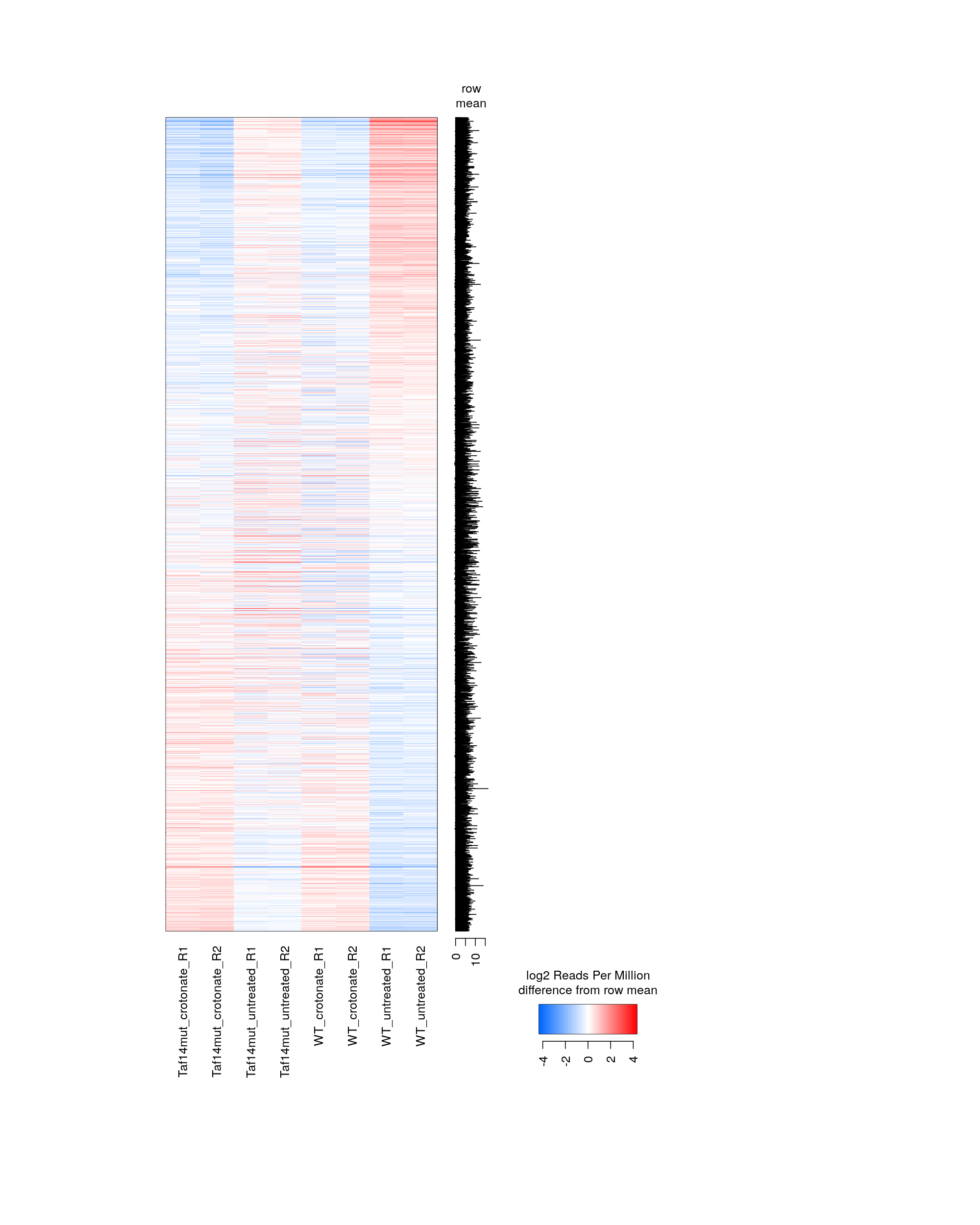
 AS5_13-Oct-2019-peakwise--pooled-heatmap.png (915.1kb) ⋅ [spreadsheet]
Genes were selected based on there being at least some fold change difference between some pair of samples.
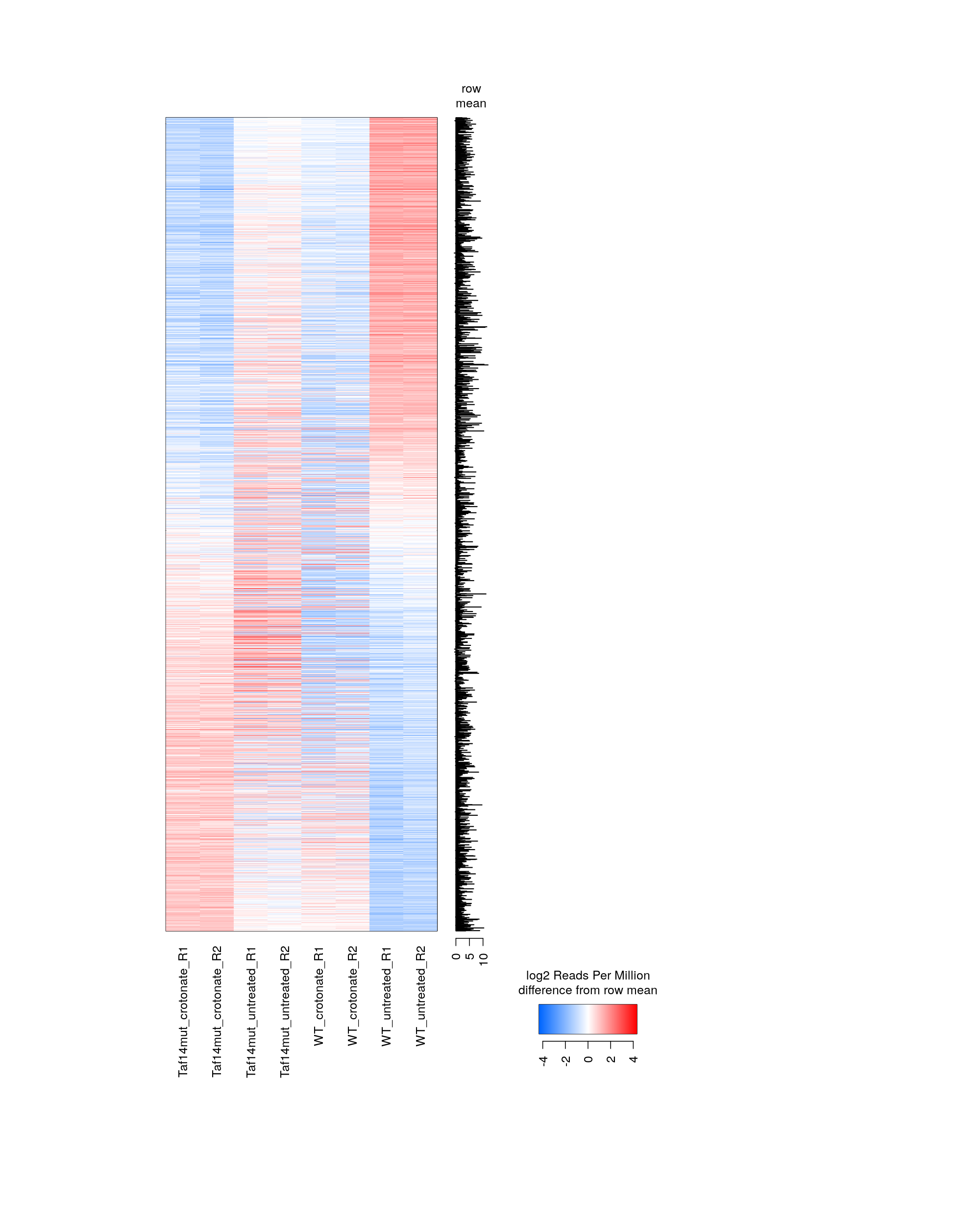
 AS5_13-Oct-2019-peakwise--heatmap-min-fold-1.5.png (171.6kb) ⋅ [spreadsheet]
 AS5_13-Oct-2019-peakwise--heatmap-min-fold-2.0.png (174.6kb) ⋅ [spreadsheet]
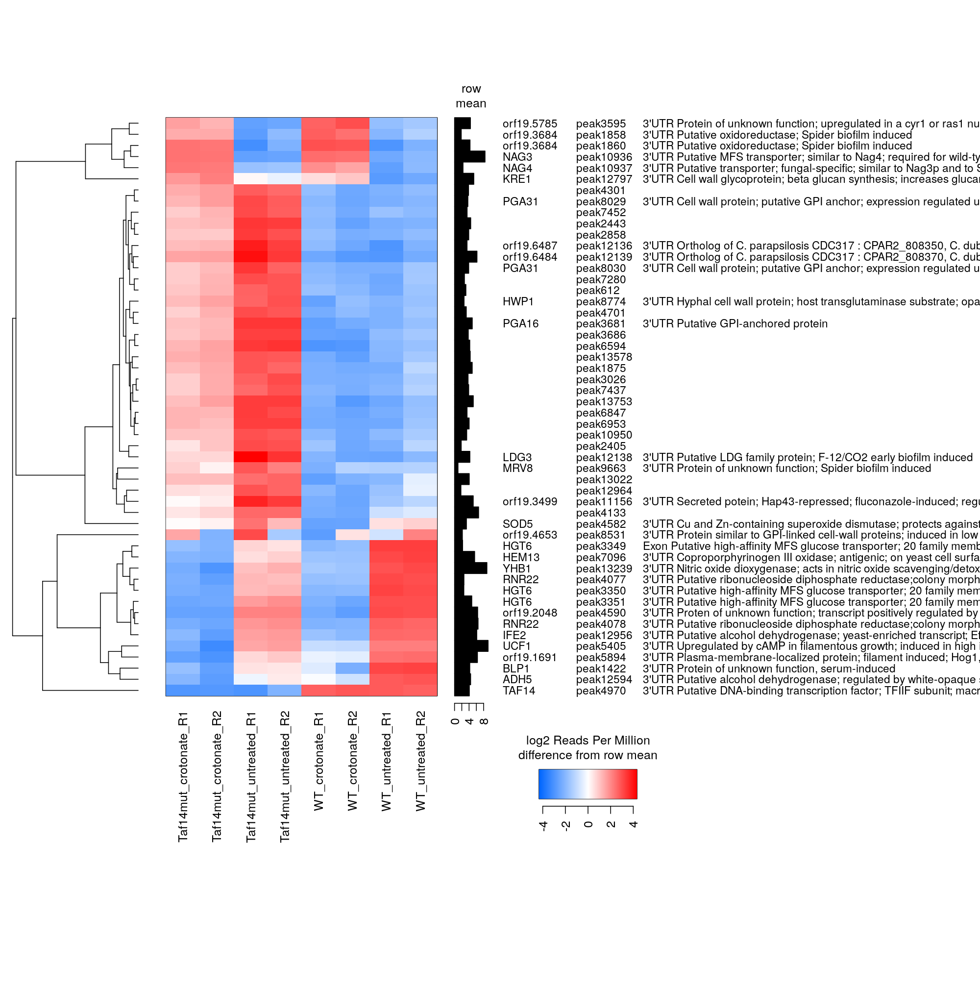
 AS5_13-Oct-2019-peakwise--heatmap-min-fold-4.0.png (163.9kb) ⋅ [spreadsheet]
 AS5_13-Oct-2019-peakwise--heatmap-min-fold-6.0.png (215.1kb) ⋅ [spreadsheet]
 AS5_13-Oct-2019-peakwise--heatmap-min-fold-8.0.png (169.7kb) ⋅ [spreadsheet]
 AS5_13-Oct-2019-peakwise--heatmap-min-fold-10.0.png (1.5Mb) ⋅ [spreadsheet]
 AS5_13-Oct-2019-peakwise--heatmap-min-fold-20.0.png (579.7kb) ⋅ [spreadsheet]
 AS5_13-Oct-2019-peakwise--heatmap-min-fold-30.0.png (381.4kb) ⋅ [spreadsheet]
 AS5_13-Oct-2019-peakwise--heatmap-min-fold-40.0.png (313.1kb) ⋅ [spreadsheet]